Lick is definitely one of our favourite new names on the paint scene. Although they've only been around for a couple of years, with their distinct jerry can tins and eye-catching shades with simple numeric names, Lick paint has definitely made its mark on interiors enthusiasts.
After launching online in 2020, they've just opened its first-ever bricks and mortar store on London's Northcote Road, with plans for further Lick paint stores around the UK - so they've definitely got their finger on the pulse of the latest trends. That's why we were excited to find out the brand has put together a colour palette of eight shades that will define 2023. And to get a head start on other decor looks that are about to blow up, check out these interior design trends for 2023.
On a practical note, if you need to update your painting kit, we've tried-and-tested a range of brush sets to find the best paint brushes and put together a buyer's guide of the best painting tools - you're welcome.
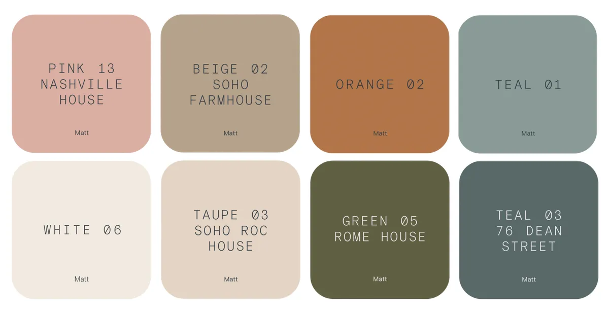
Much like Dulux's Colour of the Year 2023 - Wild Wonder - the Lick paint palette for 2023 is inspired by nature and a need to engage our senses and reconnect with the world around us.
'We predict that in 2023, people will be gravitating toward a nature-inspired colour scheme of grounding neutrals, paired with earthy oranges, rich greens and mentally-stimulating teals,' says Lick trend expert Matilda Martin.
'These colours will encourage you to slow down and be more mindful of your environment, to look out the window and take a moment to reconnect with the natural world that surrounds you'
Nature is a source of healing, energy and stability. And so are the colours in this palette. Their warming yellow and pink undertones will both calm and recharge you, whilst their heavy black pigment gives them a grounding, timeless feel.
Matilda says the new palette is made up of what she calls 'slow colours', shades which are strong and characterful but subtle enough to remain inviting for years to come.
'From the dusty pinks and rust oranges of Arizona’s sandstone rocks to the olive greens and earthy beiges of Grecian forests, the colours in this palette capture the comforting natural hues of landscapes and seascapes from around the world.'
Read on for Matilda's secrets on how to create four very different moods using colours within the palette: earthy and grounding, energising, nature's neutrals and mentally stimulating:
Earthy and grounding
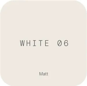
Our lightest hue in the palette, White 06 is not your average white. This contemporary neutral has chalky pink undertones which makes it physically soothing. The perfect option for creating a warm, calm and peaceful space.
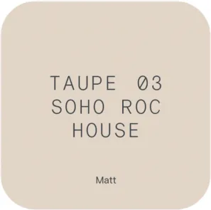
Taupe 03 Soho Roc House is our stone-coloured neutral that encourages relaxation. A mix of light brown and grey with subtle notes of pink, it will ground and reassure you.
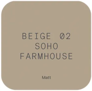
The colour of the earth and wood, Beige 02 Soho Farmhouse is solid, dependable and totally cocooning. Beige 02’s warming yellow tones will envelop and comfort you, whilst connecting you to the outdoors from the safety of your home
For white and neutral decor inspo, check out our white living room ideas and white bedroom schemes, as well as beige bedrooms that are anything but boring. And don't forget to learn more about how to use earth tones in your home decor.
Energising
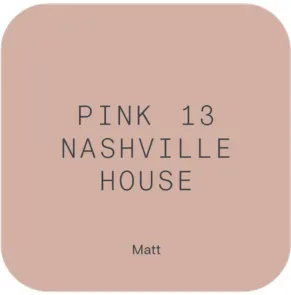
Pink 13 Nashville House is dusky, warming, and packed full of emotion. The subtle touch of grey gives this hue an earthiness that will instantly ground and recharge you. A hug in a paint tin, pink has the ability to make your shoulders drop, making you feel physically safe.
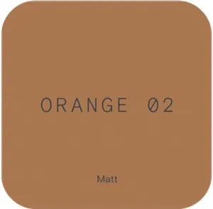
An earthy orange with grounding brown undertones, Orange 02 brings a burst of energy into this palette. This hue will bring joy to any space, stimulating conversation and social interaction.
Looking for more pink room ideas? We've got inspiring pink bedrooms, classy pink living rooms, pink bathroom schemes and even ideas for pink kitchens.
Nature’s neutrals
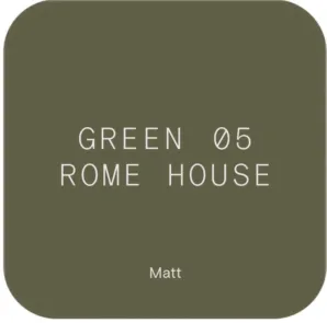

Nature’s neutral, the colour green reconnects us to the natural world and symbolises life and re-growth. Simultaneously rustic and elegant, Green 05 Rome House’s earthy olive hues will immediately transport you to luscious forests, bringing life and optimism into your home due to its warming yellow undertones.
We're huge fans of green decor schemes - and to prove it, we've gathered our favourite ideas for fresh green bathrooms, nature-inspired green kitchens, and gorgeous green living rooms as well as soothing green bedrooms.
Mentally stimulating
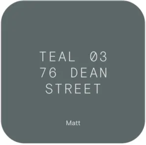


Bold and calming, Teal 03 76 Dean Street is a mentally stimulating colour that encourages introspection and clarity of thought. Cocooning and warming due to its green undertones, Teal 03 really comes into its own as the sun sets - giving you a moment to reconnect with yourself.
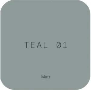
Lighter Teal 01 combines the mentally calming characteristics of blue with the natural energy of green. Serene and calm - this balancing hue will help you unwind.
This palette engages your senses. You’ll notice how the colours in this palette have a tangibility to them - you can almost feel the powder coming off chalky White 06, and the warmth emanating from Orange 02.
If you're totally in love with blue-green schemes, you're not alone! We've rounded up some inspiring teal living room ideas - don't forget some teal cushions, too! - and teal bedroom ideas (we even share where to buy teal bathroom accessories).
