While the term Barbiecore appears to have been coined back in 2020 to describe fashion inspired by the iconic doll, it's the upcoming Barbie movie which has sparked a rush of enthusiasm for the aesthetic.
The first stills and clips from the much-anticipated film, showing Margot Robbie in the title role alongside Ryan Gosling's Ken, provoked a wave of excitement on social media. Fans gushed over the vibrant, ultra-stylised sets and costumes, an intoxicating blend of 1980s aerobics class and 1950s diner.
Read on to find out what the Barbiecore aesthetic is all about, and discover some of our favourite Barbie-inspired home accessories.
What is Barbiecore?
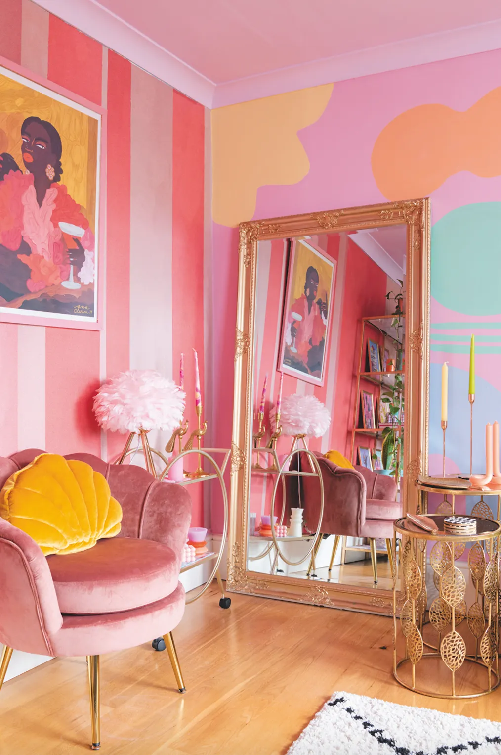
Rejecting 'grown-up' beiges and greys in favour of lurid neon colours - particularly Barbie's signature hot pink - Barbiecore is all about embracing all things kitsch. That includes a big dose of 1980s retro vibes, drawing on those era-defining neon tones and bold patterns, as well as whimsical touches inspired by childhood princess fantasies. It's fun, it's fearless, and in an era dominated by sober neutrals, it's unashamedly 'girly'.
'It’s fair to say this trend is not for the faint hearted,' says Tash Bradley, head of interior design and colour psychologist at Lick. 'It’s a bold and nostalgic trend where you’ve got to be ready to stand out, especially if you’re looking to add the hot magenta pink to your wardrobe.'
Pink is obviously the dominant colour in a Barbiecore scheme, but you don't have to stick to 'Barbie pink', the vivid fuchsia shade associated with the world-famous doll. Prevent the look from becoming overwhelming by mixing up your pinks, layering in shades from pastel to bubblegum to hot pink.
'A room or home filled with too much bright pink will quickly become overwhelming and far too intense, but that doesn’t mean we can’t have bursts of it throughout to add the lively effect of this fun new trend,' says Tash. 'Whether that’s through upcycling old furniture, adding bright fabrics through cushions or bed throws injecting the powerful colour this way will provide a lot of joy.'
When it comes to complementary colours, more is more in Barbiecore, so explore similarly bright and popping shades like turquoise, electric blue, purple and sunny yellow.
In terms of style, think '1950s dollhouse'. That means plenty of curves and waves, glossy pink lacquer and funky retro kitchen appliances.
Keep scrolling to see our favourite Barbie-inspired pink home accessories, and if you fancy giving a piece of furniture the barbiecore treatment, take a look at our Lloyd Loom bedside table transformation, using Frenchic's Raspberry Punch Paint Limited Edition Al Fresco paint, £21.73 for 500 ml and Crème De La Crème Lazy Range, £26.30 for 750ml.
Barbiecore checklist: everything you need to get the look
- 24 pink living room ideas for timeless appeal
- Pink bathroom ideas to get you inspired
- Pink kitchen accessories to jazz up your countertops
- Pink bedroom ideas for candy-coloured dreams
- 8 retro fridge-freezers to bring vintage glam to your kitchen
- The best retro microwaves for vintage kitchen style
- 7 retro kettles to give your counter a glow-up
- Wavy mirrors for instant curve appeal
- How to use pastel colours in your home
Our favourite Barbiecore home accessories
LATEC Twin Bell Alarm Clock with Backlight
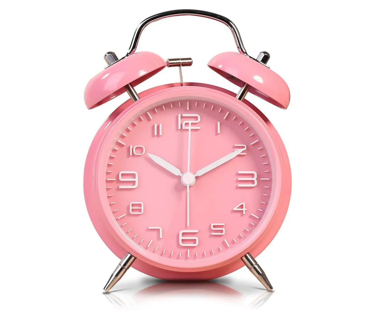
The candy pink plastic case of this bedside alarm clock from LATEC gives off that glossy bakelite look which will be familiar to any proud Barbie owner. It boasts an LED backlight for easy viewing during the night, a snooze function for mornings when you need those extra zzzs, and a silent operating mechanism so you won't be kept awake by ticking. Plus, we love that vintage twin bell design, bringing a truly retro vibe.
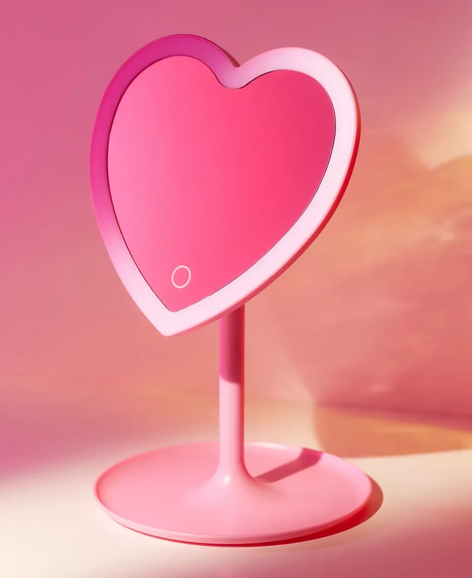
Urban Outfitters Heartbeat Makeup Vanity Mirror
- Buy now from Urban Outfitters (£19)
Barbie's Dreamhouse wouldn't be complete without a vanity mirror! We love this hot pink heart-shaped version from Urban Outfitters - if you need extra light, you can simply illuminate the LED screen with a touch of a button.
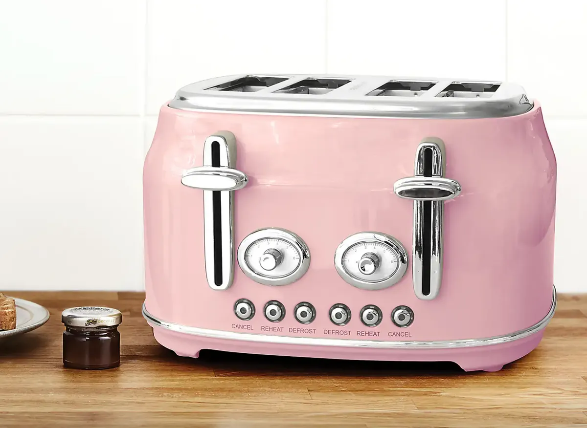
Dunelm Retro Pink 4 Slice Toaster
- Buy now from Dunelm (£45)
This gorgeous vintage-look pink toaster from Dunelm can toast four slices at a time, making it a great choice for larger households, and we can't get enough of those glossy metal controls. If this has caught your eye, why not check out more of our favourite toasters or explore more pink kitchen accessories.
M&S Pure Cotton Sand Resistant Striped Beach Towel

- Buy now from M&S (£17.50)
The Barbie teaser trailer promises plenty of sun-drenched boardwalk fun, so this eye-catching pink beach towel from M&S felt like the perfect fit! Not only does the design stand out on a crowded beach, featuring stripes in varying shades of bold pink, but it's also specially woven to prevent sand from sticking to the material.
Polaroid Now Pink i-Type Instant Camera
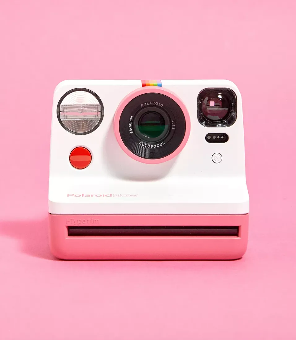
A Polaroid instant camera is the ultimate cool throwback accessory, and such a fun way to capture special moments on the go. This pink version retains all the period charm of the original series, but includes useful modern touches such as a rechargeable lithium-ion battery powered by the included USB charger.
Pink Balloon Dog Statue
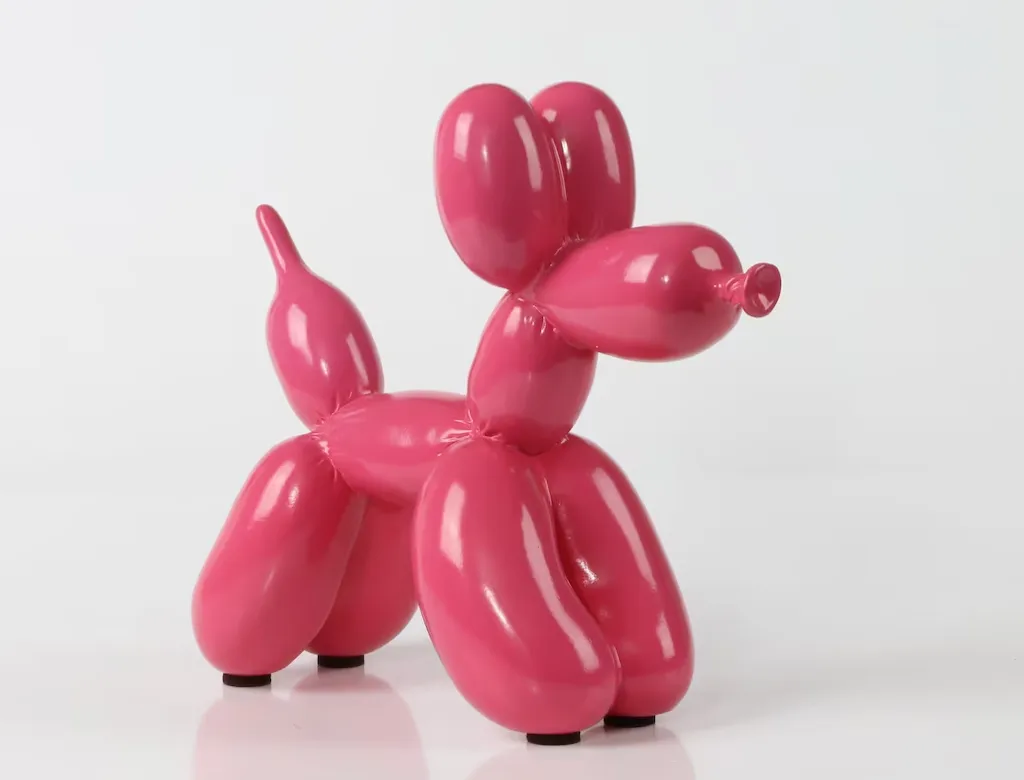
- Buy now from Etsy (£33.99)
Cute, colourful and fun, balloon dog ornaments are the ultimate Barbiecore accessory. Etsy offers a range of the sculptures in different sizes and colours, but we're partial to this hot pink version. Made of resin with a hand-painted finish, we love the puckered balloon detailing on the joints.
Homebase Soft Washable Rug

- Buy now from Homebase (£50)
Sweet, snuggly and soft underfoot, this 150cm x 100cm shaggy pile rug from Homebase is just the right size for adding a pop of cosy colour to a bedroom or for slipping underneath a coffee table. Machine-washable and lined with anti-slip backing, it's a practical as well as stylish choice.
GPO Rydell Retro Portable Radio
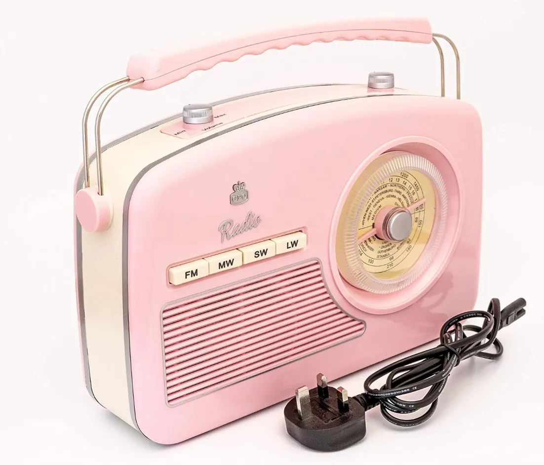
If you're a fan of the vintage look, a retro radio make a fab addition to your decor. This pastel pink portable radio from British brand GPO, which specialises in midcentury-style telephones, turntables, speakers and radios, is bursting with retro charm thanks to details like tuning and volume dials and a sturdy carry handle.
The set comes with a wired plug for mains power, but can also run on batteries (not included) for use on the go. This four-wave version picks up FM, MW, long-wave and short-wave broadcasts - plus, if analogue isn't your jam, there's a DAB version, too. Also available in cream and black.
H&M Home Round Metal Tray
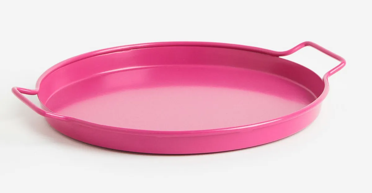
- Buy now from H&M Home (£17.99)
This vibrant fuchsia metal tray from H&M Home is just the job for serving up a jug of your favourite punch to garden party guests this summer, with a high rim and sturdy side handles to reduce the risk of party-pooping spills.
Fuchsia Tapered Candles
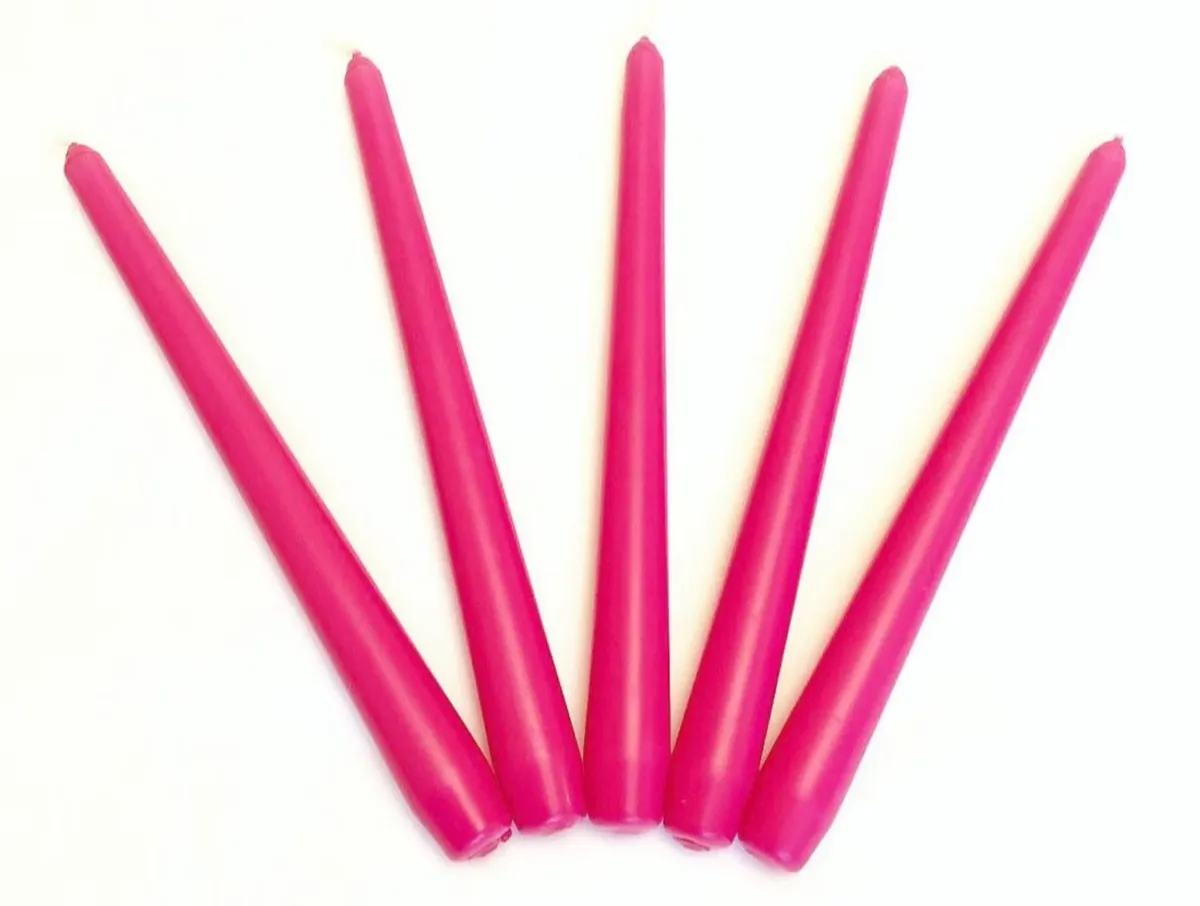
- Buy now from Etsy (£7.50 for three)
Tapered candles are a versatile and super-cheap option for adding colour and character to a space in need of pizzazz - and none more so than these vivid magenta candles from Etsy maker KokosGiftShop. They're handmade, and come in sets of three, four and six.