Antonia Richards wasn’t afraid to rethink her entire floor plan in a bid to create a spacious home that works for the whole family.
Here, she shares her home makeover experience...
My makeover story
When we decided to move, there was little on the market within our budget. This place didn’t have a great layout as the whole ground floor was a garage and utility room, but it did have amazing potential to be a lovely family home, so we went for it.

We didn’t have money for renovations at first, so we lived here for two years while we saved, which gave us time to work out the best use of the space. We realised the kitchen needed to move from the middle floor to the downstairs, so we had plans drawn up that gave us three storeys of living space.
Welcome to my home...
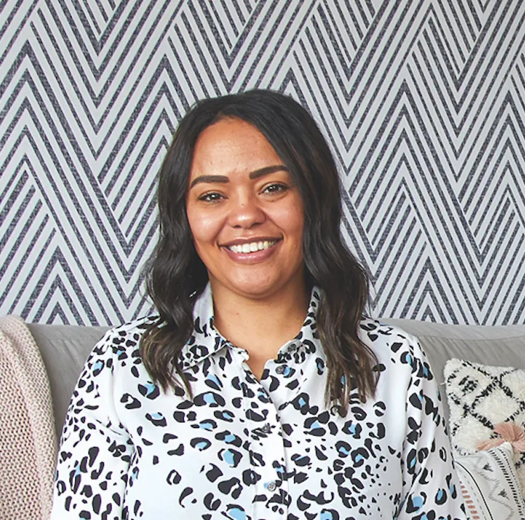
A bit about me I’m Antonia Richards, an occupational therapist. I live with my husband, Carl Curtis, a computer programmer, and our two children, Isaac, 15, and Georgia, 10. I Instagram my renovation journey @all_things_interior_.
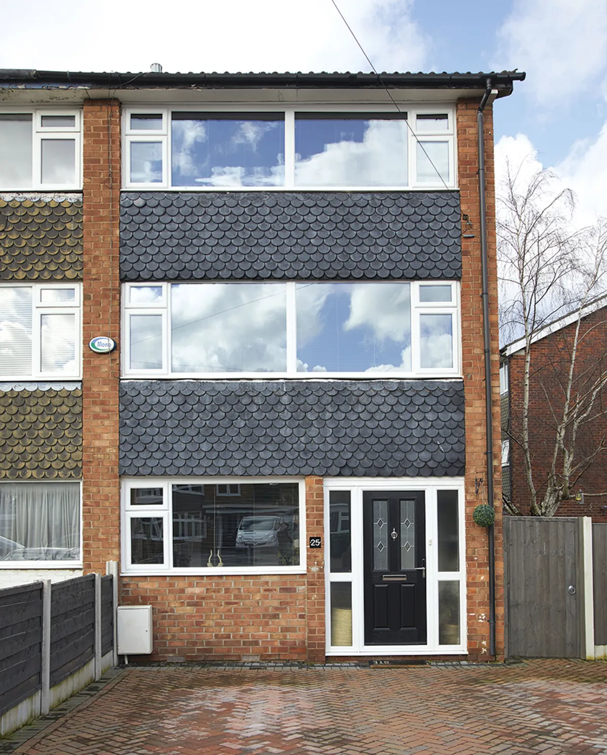
Where I live My home is a three-storey, three-bedroom, 1960s townhouse in Heald Green, Stockport. We’ve lived here since 2014.
Originally, we were only going to do the ground floor, but we discovered the house needed a full rewire and new heating system, so we decided to renovate the whole house in one go. We started with the kids’ rooms, so they had a place to escape the chaos.

At one point the top floor was one huge room as we knocked down the walls to create three larger bedrooms. Then we reconfigured the downstairs layout to include a dining room and snug, which allowed us to have a large family living room in the middle.
A bit more about my home...
What I wanted to change The design of the house didn’t make full use of the space available as the ground floor was an integrated garage. We knew that we would need to change the layout to make it work better as a family home.
How I made it my own We reconfigured the whole house and incorporated the ground floor into the main living space. Then I added lots of colour and decorated using budget-friendly upcycling hacks.
My favourite part I really like the snug as it does its job well, giving us a relaxing spot by the kitchen that opens up to the garden. I also love the panelling in there as it feels a bit different.
We were lucky that the work went well and although some of our decisions changed along the way, I don’t see them as mistakes but learning curves. It’s all part of the process of creating a beautiful home.
Living room
‘I knew I wanted to add panelling in here and I always like to use up leftovers, so the wall behind the slats is yellow paint left over from the dining room. To be honest, I’m never quite sure of the full plan before I start a project. My mantra is ‘why not, it’s only paint,’ but I was nervous about wallpapering the living room as it’s the only paper in the house, and looking at it now I realise I’ve colour blocked the wall by not going to the ceiling or right to the edge.

‘But because it’s an open-plan room, I feel it houses the sofa and defines the living area. We hung the paper ourselves and it was tricky in the corner because there’s no straight walls in this 60s build, so it took a while to work out the pattern.’
Dining room
‘I’m pleased with the final layout down here. Although this isn’t the widest room, I’ve worked with it, so I made sure the shelves were narrow and didn’t impact on the space too much and I put a large mirror on the wall to make the room feel bigger. I decided to put the yellow block at the top of the wall and then thought I’d keep going down the side – there’s no rule book saying how colour blocking should be!

‘I’d seen a cabinet online that I really liked but at £1,500, it was way out of my price bracket, so I decided to make my own. I bought this IVAR cabinet from IKEA, painted the doors black and then glued on some stained wood strips and added the legs. To me, it’s just as good, if not better, than the expensive one that I first saw.’
Kitchen
‘The original plans put the kitchen at the front of the house but I knew this wouldn’t make the most of the space and would give us very little storage. I knew arranging it in the middle would give us the biggest usable area. I originally chose a cream gloss kitchen from Howdens but in the end I thought it was too safe.

‘I noticed people upgrading their kitchens cheaply by simply painting the units, so I decided to paint them myself, which saved a fortune. The original laminate floor had cracked so I wanted to replace it with a feature floor and as soon as I saw these tiles in Tile Giant I knew they would be well-suited to the new green cabinets and the mustard accessories that I already had.’
Master bedroom
‘This used to be two rooms, but we knocked through to create a big master bedroom with a walk-in wardrobe. After painting the wall, I felt it needed something else and though l liked the panelling effect, I wanted to do something different as the popular designs felt quite samey.

‘We bought long pieces of wood and literally just made this design up as we went along. It was the first time I’d attempted panelling and because I hadn’t drawn it out, I wasn’t sure if it would work but it’s been a game changer and adds a lot more interest to the simple square room.

‘The Paris print is a romantic reminder of when Carl proposed to me at the top of the Eiffel Tower.’
Office
‘Although the renovations meant we lost a bedroom, it was okay because we managed to squeeze in a small office in what used to be the kitchen. We can always turn this into a bedroom, but we’d rather have more day-to-day space than an under-used spare room.

‘People think my terrazzo wall is either wallpaper, stencils or decals but I hand-painted it using different coloured tester pots and tins of unused paint. The cabinet in here was upcyled in the same way as my dressing table.

‘I originally wanted to use rattan for the doors but discovered it was really expensive, so I bought a massive roll of cheap anti-slip rug underlay instead, sprayed it with a couple of coats of paint then attached it with spray adhesive and it’s just as effective.’
Bathroom
‘This was the last room in the house we changed as it was all in good working order. It originally had a three-piece suite with a shower over the bath and the loo under the window, which took up way too much floor space, so we reconfigured the room, and by putting the bath under the window we freed up space to include a separate shower cubicle, which is really handy to have.

‘I was originally going to go for a funkier design with the tile layout, but the builder felt he couldn’t line the grout up well enough to make it look good, so I went for this uniform stacking pattern instead, which I think works.’
Feature and styling Lisa Moses. Photos Katie Jane Watson.
This is a digital version of a feature that originally appeared in Home Style magazine. For more inspirational home ideas, why not subscribe today?