
Britt managed to turn a characterless house into a vibrant, cosy home, filled with eclectic art and bold patterns. Here, she tells us about her home makeover story...
My home makeover story
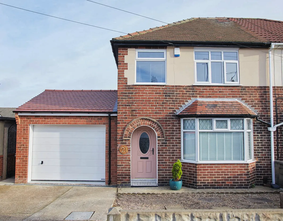
We were living just a mile away when we saw this place. To be honest, it was my partner Joe who wanted it, but I wasn't sure. I’m drawn more to characterful, period-style homes whereas this is a modern house that seriously had no personality.
The idea of open-plan living appealed though, and I really liked the layout with the bi-fold doors out to the garden, so we decided to go for it.

Luckily, the house didn’t need structural work as all our money went on buying it, but every single room was white or grey and very boring. We love pattern and colour, so I had to work hard to make it reflect us.
I’d always wanted a black room, so this felt like the time to try it out, and being bookended by windows means that the long room can take the dark look.
Welcome to my home...
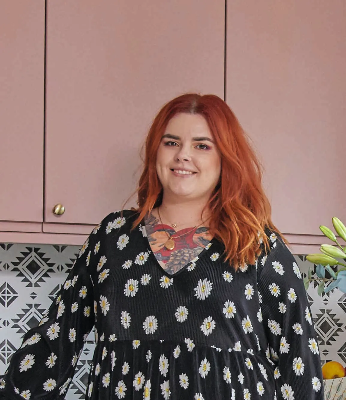
A bit about me I’m Britt Spurr, 31, a beauty and nail technician. I live with my husband, Joe, 35, a biomass engineer and our French bulldog, Opie.
Where I live My home is a three-bedroom 1930s semi in Mansfield and we moved here in December 2019. I Instagram about our home at @opiewinstons_house.
I hated the white kitchen we inherited, but we couldn’t afford to replace it, so I did some research and decided to paint the cabinets and the splashback and it made such a difference.
It took a bit of work, but looking back, the transformation has been amazing, and it’s really helped me fall in love with the house.
Kitchen
The kitchen was brand new when we moved in, but I hated the gloss white doors and glitter splashback. However, we couldn’t justify ripping it out, both financially and from an eco point of view. I’d seen people paint their kitchens on social media, so I thought I’d try it.

I took the doors off and sanded them, then painted them in Dusky Blush by Frenchic. It took four coats to completely cover the white, but it was totally worth it as it’s transformed the room.

We couldn’t afford to retile the splashback so I decided to try my hand at stencilling. I covered the tiles with a base coat and then used a stencil from Dizzy Duck Designs. I finished it off with a heavy-duty topcoat to protect it and the result is amazing.
A bit more about my home...
What I wanted to change Because of the modern extension, there were no original features in the house and it felt characterless, like a building full of white boxes. I really wanted to add some of our own character to it and make sure it reflected our taste as a couple.
How I made it my own I used my love of bold colours to paint everything I could, including the stairs and kitchen cabinets, and then finished the look with my collection of colourful prints and vintage furniture.
My favourite part I love the hallway and landing. We’ve painted it black – which took a lot of patience – and added lots of wall art so now it really reflects our style.
Dining room
It made sense to put the dining table in the middle of the open-plan space – next to the kitchen area, for practicality, and by the doors out to the garden for summer dining – but I’ve zoned the area using this large rug from French Connection.

The table was originally the other way round, but as the floorplan is so big here, this created a massive, empty space between the dining room and the kitchen. Simply turning it around has made the room feel more connected.
I love original vintage furniture, but it’s hard to find anything affordable these days, though we did manage to find this dining table – a modern high-street version – from Argos, and I’m happy to mix vintage furniture with modern classics.
Living room
The downstairs had already been extended and as the whole ground floor is open-plan, I decided to zone it and create separate areas. There was already decent flooring down, so I only had to think about the décor.

I decided on black walls for the living area, which is something I’d wanted to try for a while, and it shows off our colourful prints really well. I did a colour match, as it’s so much cheaper, and did the painting myself.

I can’t justify paying someone to paint a wall and it only took two coats, so it was easy. We love tattoos and my inspiration came from tattoo parlours where every shop has the artist’s work on the wall.
Beauty room
I’m a nail technician and work from home so this room was always earmarked as my workspace. When lockdown happened last year and work stopped, I decided it was a good time to paint this mural and add a touch of fun to the room.

Everyone had such a bad time that I wanted to create a space my clients would also enjoy being in. I gathered together all our leftover paints and tester pots and then just painted it freehand, though I suppose it’s inspired by my nail art that I just supersized.
Bedroom
I’ve always been a bit alternative and I’m definitely drawn to dark colours. It’s such a nice, cosy feeling waking up in a dark room, so this was the first space I tackled as it was quite literally a white box when we moved in.

I chose Valspar’s Leafy Greens for the walls. It has a lovely warm tinge to it that complements our bright yellow bed perfectly, and my mum helped with the painting, so it only took a few hours.
We already had the furniture in the room, which meant that Joe had to keep moving the bed around as we painted each wall. We got the bedside drawers at different times, both from charity shops, so they don’t actually match, but I quite like that quirky touch.
Bathroom
We didn’t really need to do anything in the bathroom as it was newly installed, but I did put up a new black blind. We also fitted a new shower screen and gave it – as the Instagram world would call it – the Crittall effect.

I simply added black electrical tape to the glass to make it look like original Crittall steel-framed windows. It’s so effective and a lot cheaper than the real thing, though I chose to do a horizontal design rather than the more traditional look of creating squares.
What I learned...
- Sometimes mistakes happen, and that’s okay. I originally papered the kitchen wall with a green palm print, but it really didn’t work, so I stripped it off and painted the wall green. If it goes wrong, don’t panic as you can usually just start again.
- To get a good finish when you’re decorating, patience is essential. I had to paint four coats in the kitchen and three undercoats on the splashback, but it was worth it, as I know the cabinets won’t chip and the splashback won’t wear away.
- Not everything has to be vintage. I’ve found some great, quality furniture on the high street that looks fantastic and complements my original pieces perfectly. There are great options to be found in so many places, so don’t limit yourself.
Feature and styling Lisa Moses. Photos Katie Jane Watson.
This is a digital version of a feature that originally appeared in HomeStyle magazine. For more inspirational home ideas, why not subscribe today?
