Farrow & Ball paint colours are a subject of intense interest for any interiors obsessive. Iconic for their instantly recognisable rich pigments - when you see Farrow & Ball , you just know - if you're a keen decorator, there's a good chance you'll even know the names of all your favourite shades (we're suckers for Green Smoke!).
Here, Farrow & Ball colour curator Joa Studholme reveals the colour palettes that will define 2021, and explains what they represent and how we should be using them.
Don't miss Farrow & Ball's colours for 2o22!
Rich and Warm
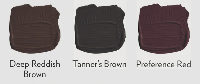
Buy Deep Reddish Brown
Buy Tanner's Brown
Buy Preference Red
'In challenging times, we crave warm tones that will enrich our homes and create cosy sanctuaries away from the outside world. Luxurious colours like Preference Red can be added to the most neutral of palettes by using them in rooms we use at the end of the day, when we most want to relax and be comforted.
In 2021 we have moved away from dark charcoals and blues and towards the warmer tones of nature, like Deep Reddish Brown and Tanner’s Brown, which are strong and subdued but achingly fashionable.
'Incredibly chic by day and cosy by night, they bring a grounded but luxurious atmosphere that is thought-provoking as well as soothing, particularly when paired with other hues found in the natural world.
'All three of these chocolatey tones are particularly suited to bookshelves and library shelving when used in Modern Eggshell.

Complimentary Colours
White: Dimity
Neutral: Joa’s White
Mid: Jitney
Strong: Studio Green
Clean and Timeless Blues

Buy Pitch Blue
Buy Stiffkey Blue
Buy Ultramarine Blue
'The blues best suited to anchoring our homes in 2021 are cleaner tones like lively Pitch Blue, fresh Ultra Marine Blue, and the darker, inkier Stiffkey Blue. These uncomplicated shades feel familiar, like memories from our childhood, so have a soothing effect in the home despite their cooler undertones.
'For a simple but immersive colour experience, use the colour on both walls and woodwork, using Modern Eggshell and Modern Emulsion to create the perfect family environment that is wipeable and scuff-proof! If, however, you want a more formal and traditional feel, then team these blues with All White or Ammonite on the woodwork and they will sing even more, especially when used in well-lit spaces or on central kitchen islands.
'However, when used in areas deprived of light or in evening rooms lit by table lamps, they become much richer and more luxurious in feel.'
For more inspiration, check out our guide to using blue in your living room decor.

Complimentary Colours
White: All White
Neutral: Ammonite
Mid: Purbeck Stone
Strong: Lake Red
Natural Greens
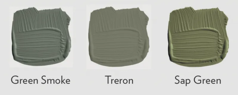
Buy Green Smoke
Buy Treron
Buy Sap Green
'Bringing the elements of the natural world into our interiors encourages personal growth as well as evoking a feeling of calm.
All greens reinforce our connection to nature and create the perfect welcoming start to the journey through your home.
'This makes greens a particularly popular choice for use in hallways, where they cause the rooms off it to feel bigger and lighter.
'The traditional grey undertone of Treron makes it feel as if it is part of your family, and, like the slightly bluer Green Smoke, it has an irresistibly inviting deepness and weathered familiarity. These are soft, smoky colours that embrace you on your return home.
'The more olive-coloured Sap Green is perfect for those who want to embrace a stronger colour with a mid-century modern feel, but still stay in touch with nature and benefit from the protective and grounding attributes of using green in the home.'

Complimentary Colours
White: Shadow White
Neutral: Drop Cloth
Mid: Broccoli Brown
Strong: Tanner’s Brown
Earth Colours
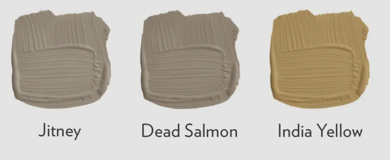
Buy Jitney
Buy Dead Salmon
Buy India Yellow
'The palette of colours we want to use in the home has expanded, and we are looking to introduce warmer tones to add personality and elegance while still remaining comfortable. Surrender to the urge to escape and find refuge in the beauty of nature by using the colours of the earth.
'Soft, understated Jitney is the perfect base colour to build upon, and so is particularly suited to kitchens where we can layer other earth colours on units and islands, to reconnect with the elements of land, clean air, and natural light.
'Modern Eggshell with its incredible knock-proof quality should be used on woodwork, while washable Modern Emulsion is ideal for the walls.
'The stronger, more mushroom tone of Dead Salmon is just as subtle as Jitney and has an even more aged, earthy look, making it feel familiar and easy to live with.
'India Yellow is somewhat stronger and moodier – the perfect colour for 2021 with its mix of aged ease and modern strength.'

If neutral and natural is your style, don't miss our guide to using earth tones in your home decor.
Complimentary Colours
White: Slipper Satin
Neutral: Off White
Mid: Card Room Green
Strong: Mahogany
Ready to get planning your own makeover? For more homes inspiration, don't forget to visit our Real Homes section - and sign up for our weekly newsletter!