German-Danish designer Gesa Hansen comes from a family of furniture designers and architects.
After graduating in Germany, she moved to Paris and worked in the studio of the famous architect Jean Nouvel. In 2009, she set up the label The Hansen Family which showcases the Scandinavian-inspired handmade furniture. In recent years, projects have included developing an exclusive colour concept for Villeroy & Boch.
Can you tell us a little bit about yourself and your childhood?
A career in design was practically a predestined future for me. I grew up in a Scandinavian family of carpenters, designers and architects. My grandfather also had a wood atelier and I spent a lot of time in there. Another childhood memory of mine includes the annual visits to Milan Design Week; my whole family set out to see the newest trends in furniture and interior design.
How has your family’s long tradition in design and architecture inspired you and what do you feel you’re adding to this?
This has inspired me a lot, not only concerning furniture design. Since 2015 I’ve also worked with ceramics and in ceramic design. My collaboration with Villeroy & Boch has extended my current work and I’ve learned a lot about this material. I also love to work with traditional things, for example creating space for rituals.

How would you describe your aesthetic?
I can’t deny my Scandinavian DNA; all my creations have a new Nordic design. The name of my label The Hansen Family is inspired from the long tradition of my family and also the way I want to work. The main idea behind the furniture is that it is handcrafted and unique. It tells a story and has a function – it is more than a piece of wood. As I’m not designing it for someone I have to please, my approach when designing a piece is to follow my intuition.
Can you tell us about the Artis washbasin by Villeroy & Boch and what inspired your colour choices for this range?
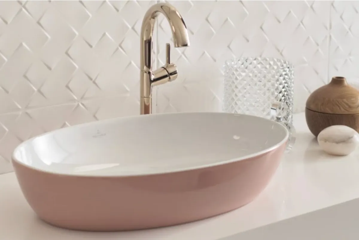
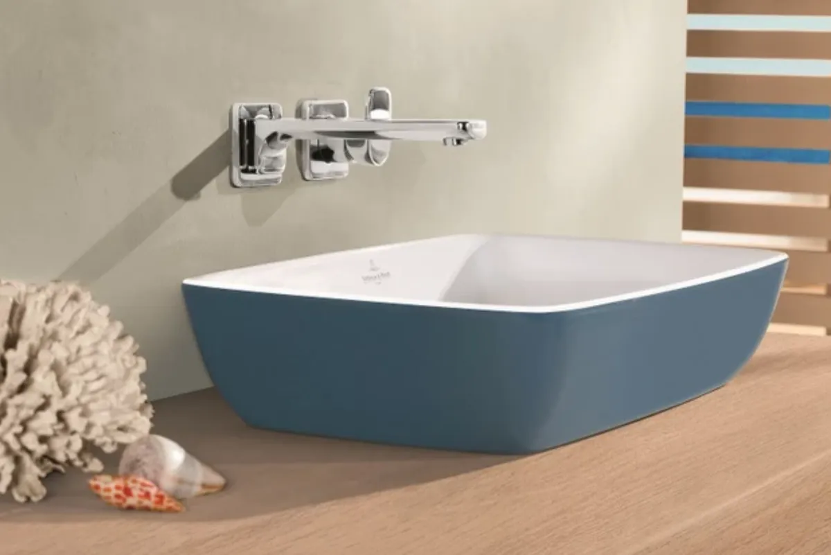
The bicolour Artis washbasin comes in a choice of four shapes: round, oval, rectangular and square. It’s made from TitanCeram which is an extremely fine and delicate material. Adding to this beauty, its geometric shape embodies the perfect reduction to the essential. Yet at the same time, ceramic is inherently a rather cold and hard material. So, to overcome this, I deliberately created soft colours. I was inspired by nature and the seasons: the fresh green of spring, the radiant summer sun, the rust-coloured leaves in autumn and the chill of winter, and of course, Paris. Its special flair, its typical way of life and the culture of the French capital are an influence to me.

How do you think colour affects our mood?
I believe colours are atmospheric and emotionally charged. I deliberately want them to arouse associations and trigger feelings. Hearing names of colours can conjure up images: take for instance the word ‘powder’ which makes you think of something fragrant and gentle. Many of us choose a classic white scheme in our bathroom.
What advice would you give to anyone choosing colour?
The key is not to combine too many bright colours or the wrong colours. It’s more about knowing what works and what doesn’t and considering what mood you want. Green shades combine well with dark wood, along with grey or white elements. Black can be used to create strong contrasts and a warm wood-brown adds naturalness to the design, while rose shades also go well with light surfaces and furniture. Rough textures such as concrete-effect floor tiling or matt metal further underscore the association to nature. If you want to add a warming touch to your bathroom, choose rich yellow or wood-coloured accessories.
You’ve described colour as ‘poetry’. Can you explain this idea in a bit more detail?
For me, colour only works in context, similar to words. For the new shades, I moved away from the idea of using a classic colour concept made up of different, matching hues and replaced it by playing with the different shades of a single colour. The result is four vibrant colour series each consisting of three colours within which the depth of intensity varies. You can think of these gradations as being similar to the base, heart and top notes of a perfume: the lightest shade represents the base, the middle, more intense colour is the heart note of the series, and in the strongest colour, the top note.
How do you think bathrooms are evolving?
Reflecting the trend in kitchens, the bathroom is increasingly becoming a living space. A homely and comfortable atmosphere is particularly important for an area in daily use, devoted to personal hygiene, health, well-being and relaxation. Light colours and soft materials can create a warm and homely atmosphere.
Words by Emma Foale
