Pantone has revealed its pick for Colour of the Year 2022... and it's a gorgeous deep violet-blue created especially for the year ahead.
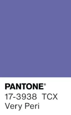
Very Peri is a deep periwinkle shade reminiscent of lavender in bloom, and Leatric Eiseman, executive director of the Pantone Color Institute, says that this bold and uplifting colour is designed to reflect a year of dynamism and creativity ahead.
‘Encompassing the qualities of the blues, yet at the same time possessing a violet-red undertone, PANTONE 17-3938 Very Peri displays a spritely, joyous attitude and dynamic presence that encourages courageous creativity and imaginative expression,' she explains.
'Creating a new colour for the first time in the history of our Pantone Colour of the Year educational colour program reflects the global innovation and transformation taking place,' Eiseman adds.
Purple hues are usually among the less common colours found in home decor, but Rebecca Challinor, interior designer at home furnishings retailer Terrys, says the choice of Very Peri actually makes perfect sense.
'Jewel tones are an already-increasingly popular trend in the interiors world, so it wouldn’t be surprising to see many interior fans readily embracing this vibrant blue shade into their homes,' she says.
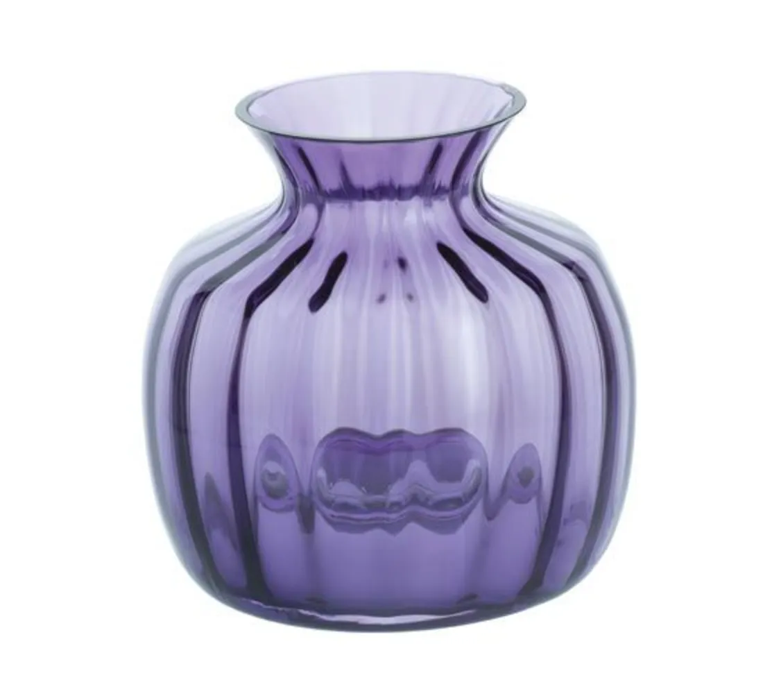
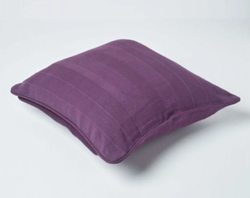
In terms of how to bring Very Peri into your home, Challinor says: 'Cushions and throws are one of the best ways to update your space without having to commit too much, though I’d also suggest looking out for statement art pieces and decorative ornaments in this vibrant shade – its set to be huge!'
Scroll down to see the high street paint shades that will give you the closest possible colour match to Very Peri! Plus, check out our Very Peri inspiration gallery of ideas for how to use this on-trend shade in your own decor.
Very Peri paint - the closest colour matches
If you love the look of Very Peri and fancy giving your walls a periwinkle makeover, many leading paint brands offer colour matching services, able to replicate any shade fabric swatch to a wallpaper sample or even a magazine clipping.
However, if you prefer the certainty of choosing a pre-existing paint shade and knowing precisely what you're going to get, we've found two colour dupes at either end of the market - a budget-friendly colour match from Dulux, and an upmarket version from one of the UK's leading premium paint brands, Little Greene.
Little Greene, Mambo

One of the UK's best-known premium paint brands, Little Greene offers high-quality and eco-friendly paints in a range of striking shades. Luckily for Very Peri fans, one of those colours is Mambo, a stunningly similar blue-purple. This dreamy hue evokes the colour of soothing lavender, so we think it would be perfect for a bedroom
Dulux, Martian Skies 2

We're not sure that martian skies are exactly what the colour experts at Pantone had in mind when they developed Very Peri, but it's certainly a strikingly close match. A smidgen darker than Very Peri, this would be ideal for turning a smaller space like a hallway or home office into a cosy jewel.
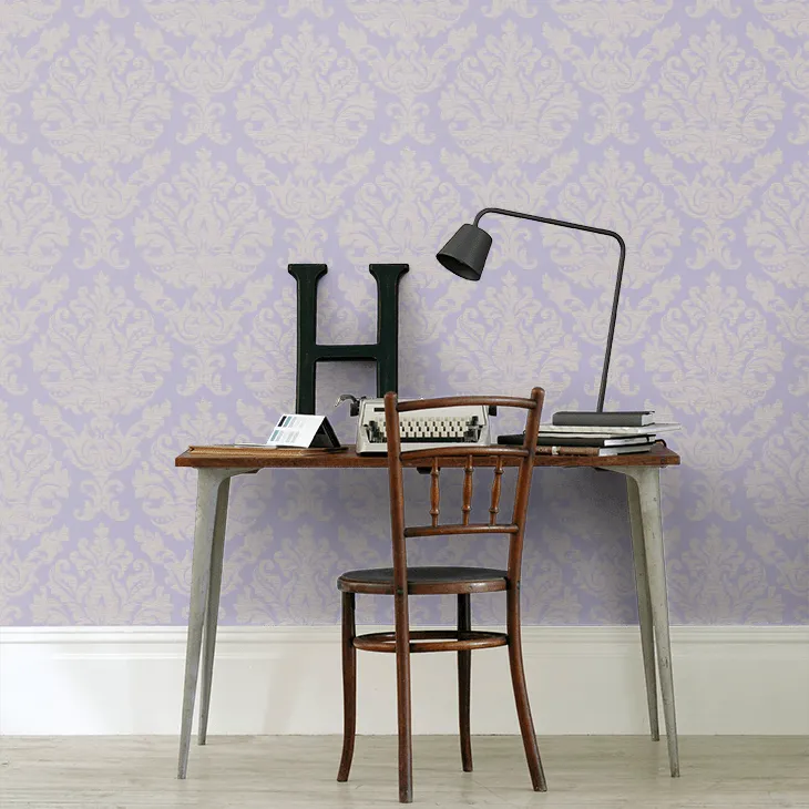
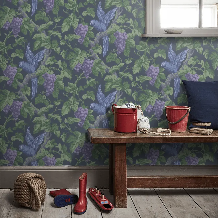
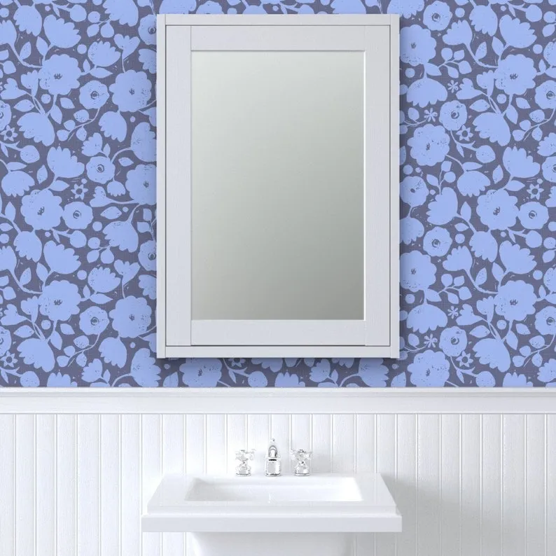
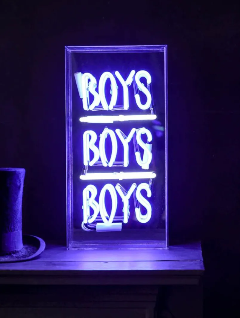
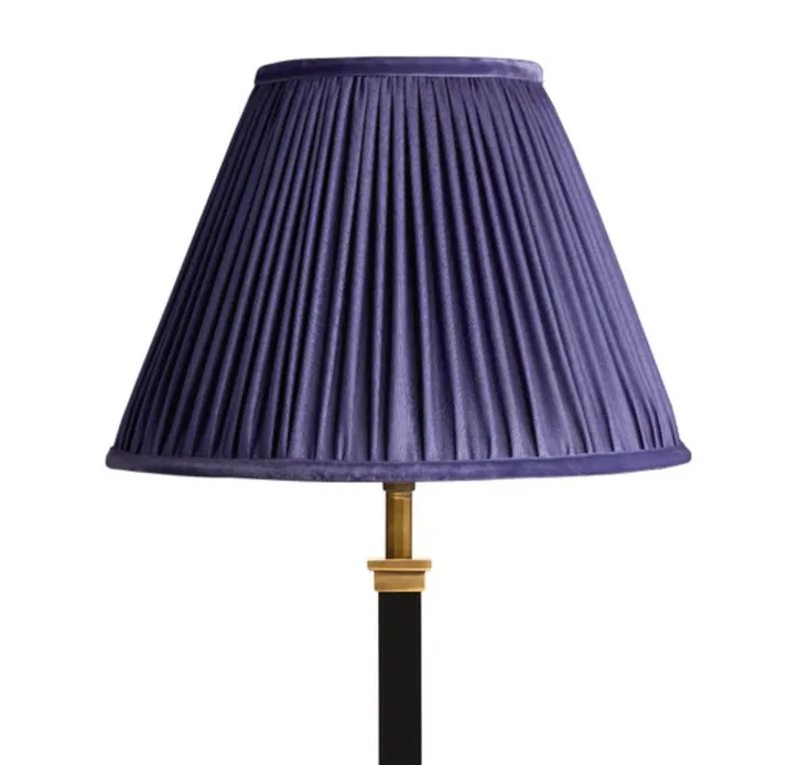
Very Peri inspiration photo gallery