International artist Rory Dobner has been drawing since he was a child.
After graduating from Central St. Martins with a Bachelor's in Fine Art, Rory exhibited his work across the globe in some of the most renowned galleriees. Now, with exhibitions at Soho House and The Royal Academy under his belt, Rory's based in London's Hampstead village and boasts commissions for the likes of Kate Moss and Christian Dior.
We caught up with him to talk all things illustration and decor...
When did you start illustrating?
All I can remember is making things and drawing, and while hunting for surfaces I discovered my father’s continuous reel of fax paper, he’d come back from work to find me like an Andrex puppy drawing at the end of a trail of paper. He built me a giant blackboard the length of my bedroom, in my memory it was like I was on a starship looking out at an infinite black space for drawing.

You use dip pens and ink, how do they enhance your work?
I wanted to give my drawings extra detail so I started using the finest nibs dipped into an inkwell, at first it was messy and temperamental and quite often in my first commissions there’s a little ant or a spider because I dropped a blob of ink in the last five minutes of finishing it, but now it’s second nature. I also use a very strong, glossy, incredibly black permanent ink, because if you use just one colour it might as well be the best one!

Tell us about how your work was discovered by Liberty?
My wife did an interview for a psychology magazine and one of my drawings was in the background. One of the buyers for Liberty was reading it and asked her where she got them from. They gave me a lovely big wall, and it was magical because Liberty is one of the great old-fashioned institutions and I never thought I would be a part of it.
Your alphabet tiles were your first collection, are they your most popular designs?
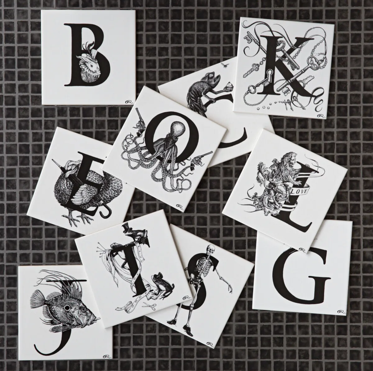
The alphabet tiles were a strange option to do first and I don’t know why but I was utterly convinced I wanted to do them. There’s a relationship between letters and pictures and if they’re bound together they make a neat package.
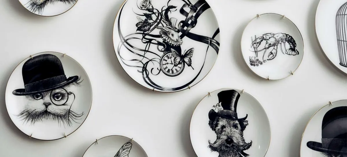
I have a ‘C’ with a curly tailed chameleon holding a cherry cupcake and I like watching the viewer’s mind as they hunt out the clues in each illustration. People like to collect the plates, you can choose them to reflect your personality so you might pick rock ‘n’ roll skulls and an octopus with guns or flowers and cats with hats on.

Tell us about your illustration of Fortnum & Mason being used to cover the façade of the building?
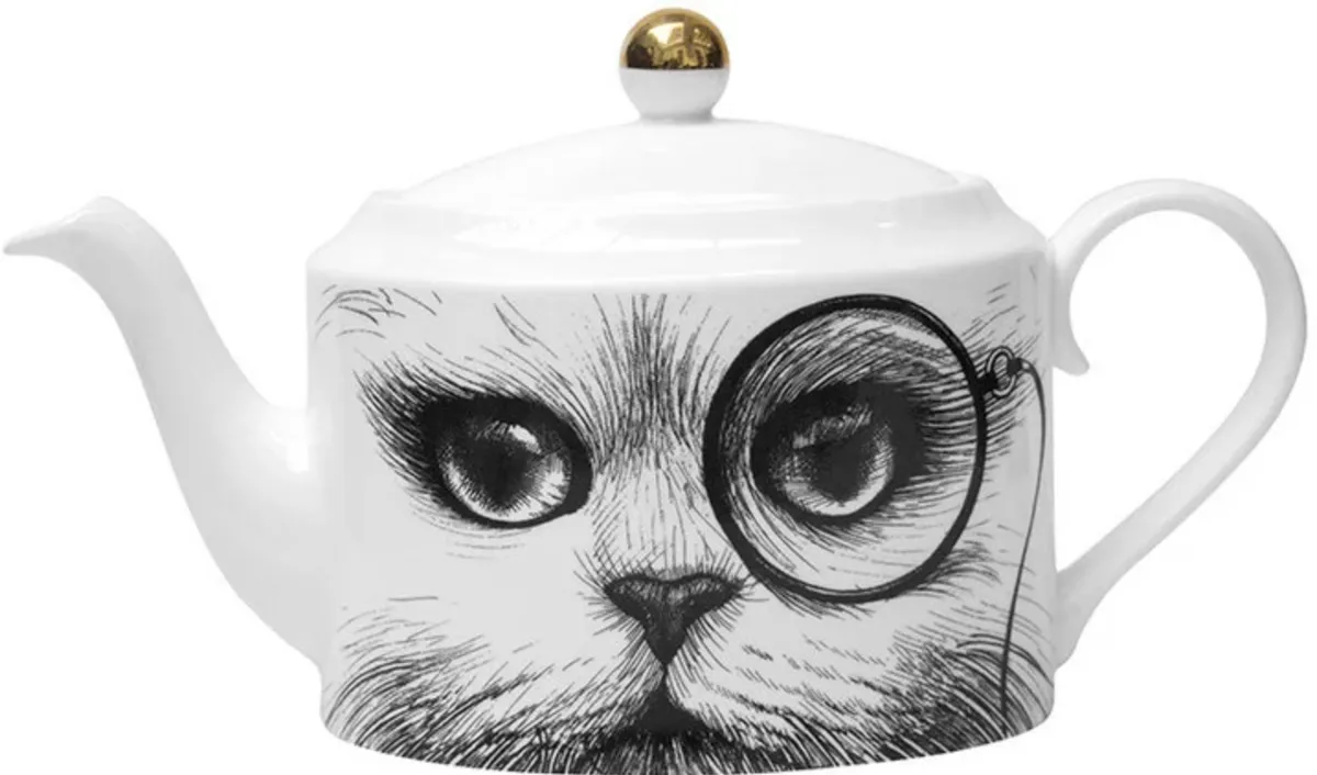
I’d drawn the building with pocket watches smashing through the walls and butterflies draping it with cloths for a tea set collection. At the same time Fortnum & Mason was undergoing refurbishment and the owners asked if they could use my building design to wrap around it. I arrived to see my drawing billow like a curtain across the street before being tied down. My heart was pounding because it reminded me of being a kid with my blackboard where I could draw things that were way over my head, and I never imagined I’d be able to do something on such a big scale.
What’s your studio like?
I built my studio on the side of my house, it has a big glass roof and there are old street lanterns on the wall above me – a fox once sat down floating above my head. He inspired one of my characters, Freddie the Fox. Freddie’s a bouncer for a secret room at the back of a restaurant where after-hours gambling takes place. He has a gun for if there’s any trouble, a skull button he found on the floor, playing cards in his hat and a pocket watch so he knows what time to kick everyone out at 5 o’clock in the morning.
I write stories to create the characters I draw and I’ve been working on a book called The Ink House, which is being published by Laurence King later on this year.
What else do you have coming up this year?
I’m partnering with Williams Sonoma to create alphabet characters and letters in America, I’ve also been asked to design an exclusive collection for Disney which is a real honour and I’m hoping to do my take on the early characters. I’m launching a new collection with Bergdorf Goodman in New York too. I appreciate every day that I can wake up and do something I love.
Words by Victoria Hrastic
